
- Description: A demonstration of my personal photography and skills in editing as well as skills in Photoshop design.
- Process (Programs, Tools, Skills, FOCUS principles): I first tarted my process by choosing a good photo amongst quite a few that I had taken. I used a Canon T83 to shoot all of my photos. Photoshop was then used to edit the photo where I adjusted the levels, vibrance, and saturation of the photo. Once I did all of this, I decided on a color scheme and I originally chose monochromatic with the color brick however I late changed that to analagous as the project continued forward. I then put my photo in an 8.5 x 11 layout adding colors from my color scheme and some text. I pulled my colors directly from a color wheel from my class book using the eye drop tool and proceeded to use circles as a design element to incorporate and label these colors into my design. I watched multiple Photoshop tutorials on how to create these circles with different thicknesses as well as how to type on curve. Once completed, my project matched the theme I had envisioned.
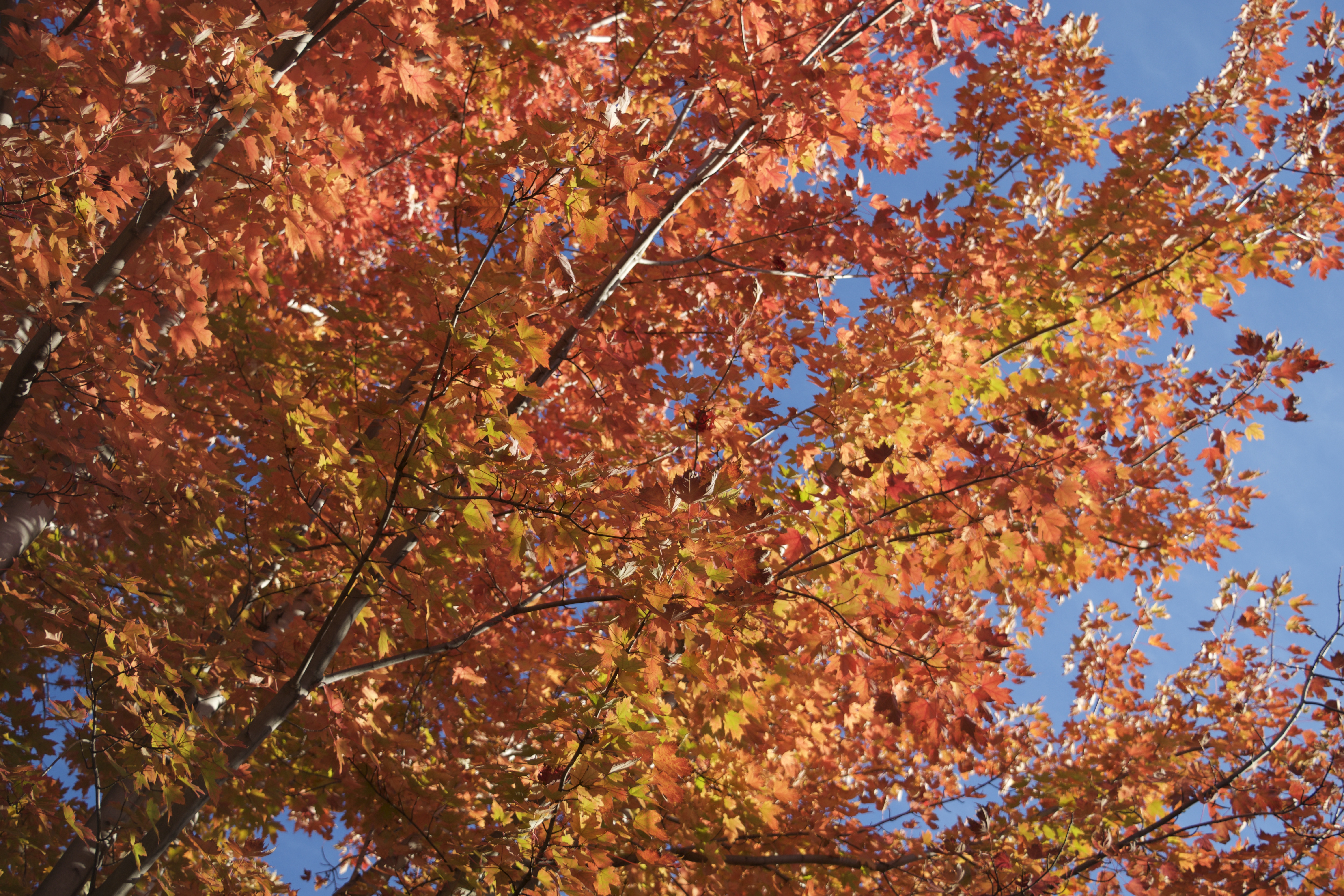
- Message: I wanted to make a design that would capture the viewers attention and go along with the current month I was in at the time of the project.
- Audience: Any Fall loving people who enjoy the colors of the leaves changing.
- Top Thing Learned: I learned how to properly edit photos in Photoshop as well as how design within the program.
- Color scheme and color names: Analagous: Brick, Red, and Orange
- Title Font Name & Category: Ignite the Light – Decorative
- Copy Font Name & Category: Helvetica Neue Medium – Sans Serif
- Date and location you took the photo(s): Tuesday, October 13th – BYU-Idaho Gardens
- Thumbnail of original, unedited image inserted:

Great photograph and design, Julia! The colors in this are amazing and compliment each other nicely! I also love the circular incorporation of the swatches — like the shape of the sun. I like the font you used, as well as the cute phrase. Your message is greatly understood by the color usage and the phrase together. Take a look at my design at https://kentuckygirlbyuiword.wordpress.com/2015/10/18/54/
LikeLike
I absolutely love your the design, it makes me so happy! I love the repeating circles and where you put your color scheme, such a fun idea. The font you used for your title copy is perfect and I think it goes so well with your design. Great photograph, you did a good job capturing it, and the sky is so blue!! Good job!
LikeLike